
New Earth Wellness Brand
Imagine this: You push down on a silver handle to open a solid wood white door and walk into a large bright room. There’s an immediate sense of calm as you smell the soft aroma of eucalyptus. You look up to see a beautiful ceiling light resembling that of a whimsical cloud and it’s casting a warm glow onto an enormous geometric egg. Yes! It’s a giant egg and it’s a sight to see!
It’s a freakin’ egg.
Sure, a giant egg that offers the benefits of sound and light therapy might sound a little ‘woo woo’…but how do you feel? There’s no pressure to know or understand it. Sometimes we just need a fun story to tell. Whether it’s a session to treat yourself or an intense spiritual journey, you’re sure to love this immersive experience.
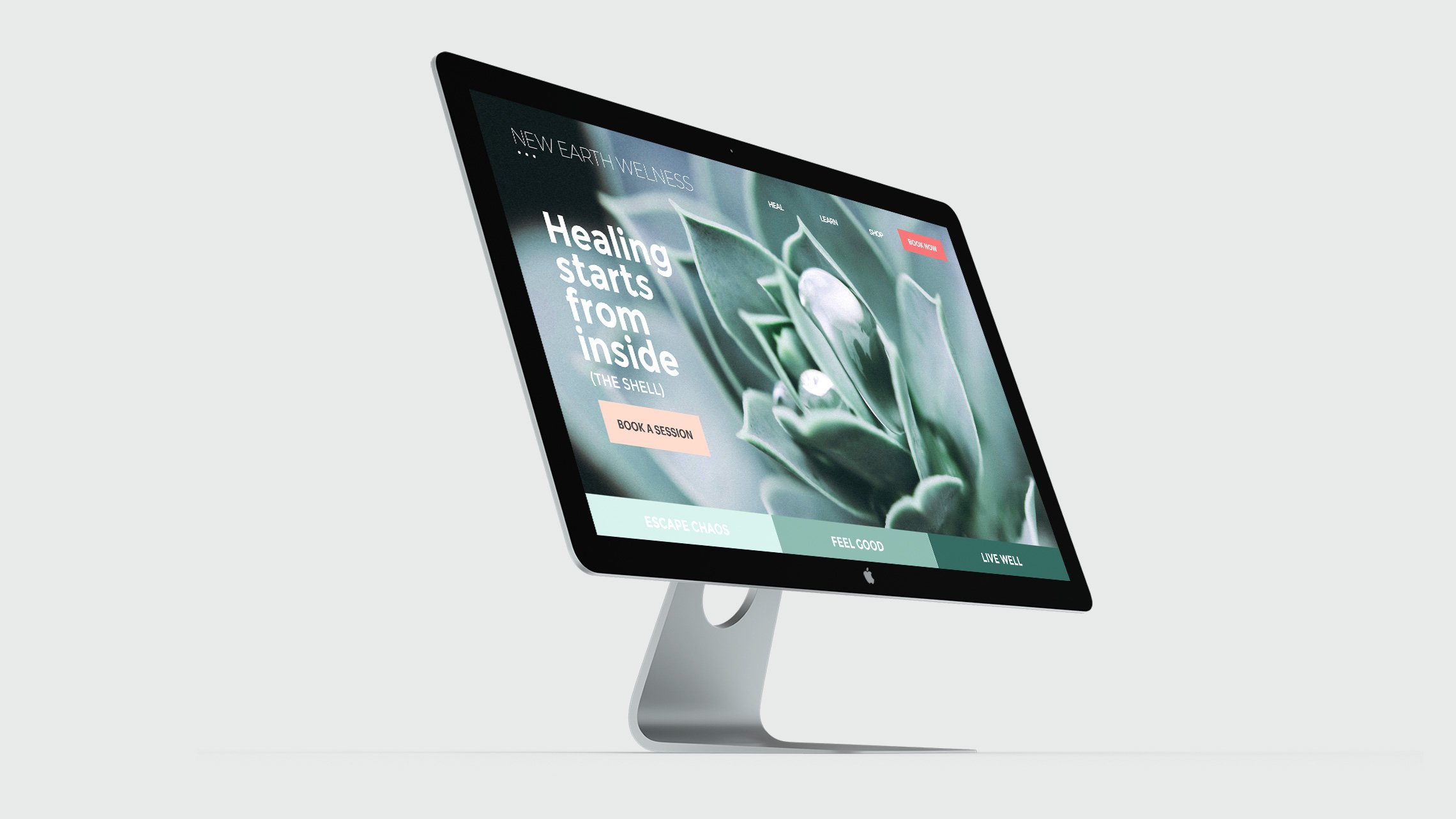


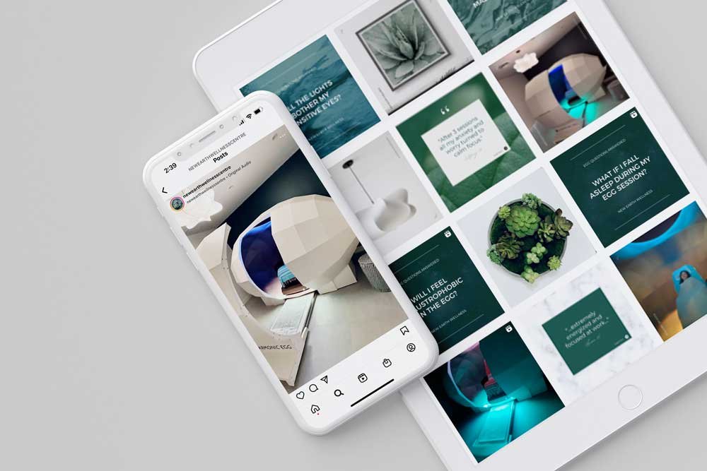
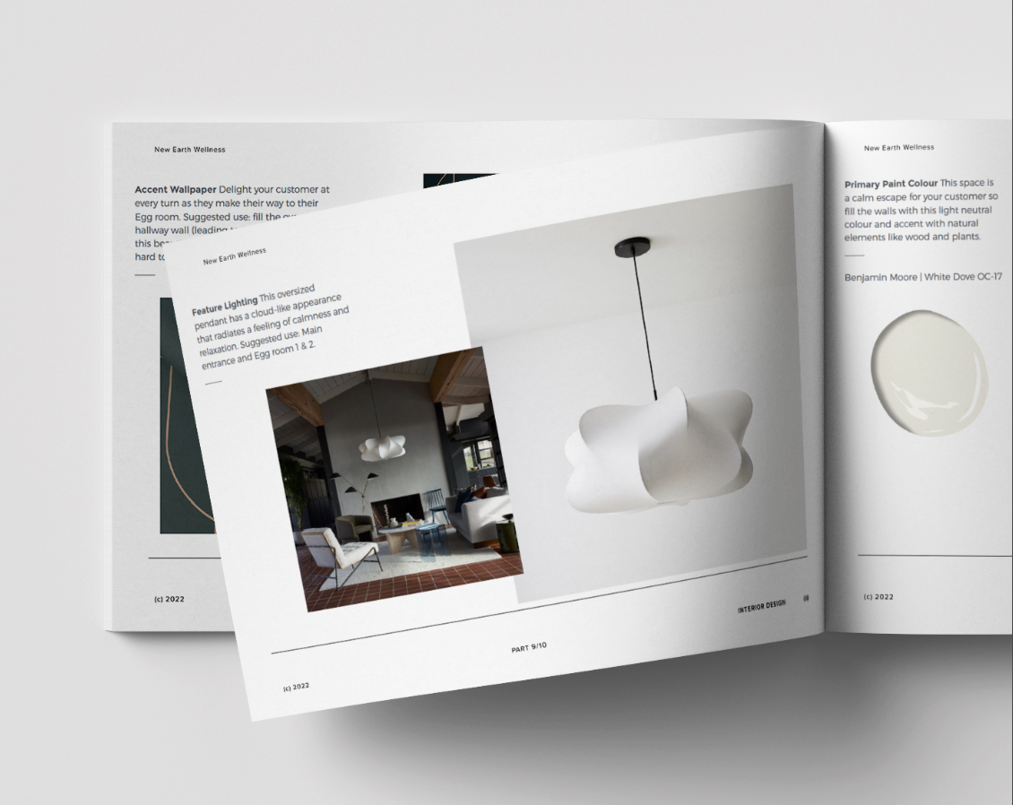
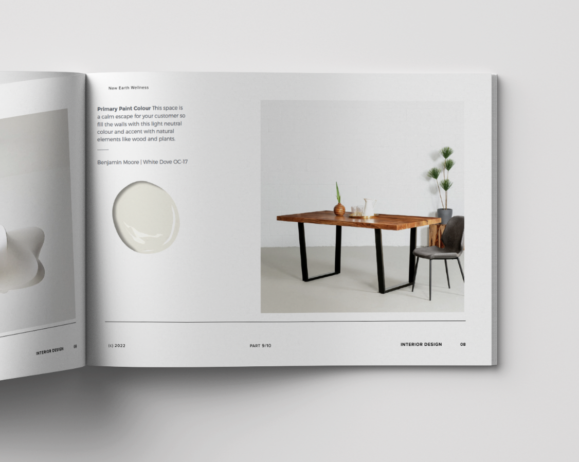
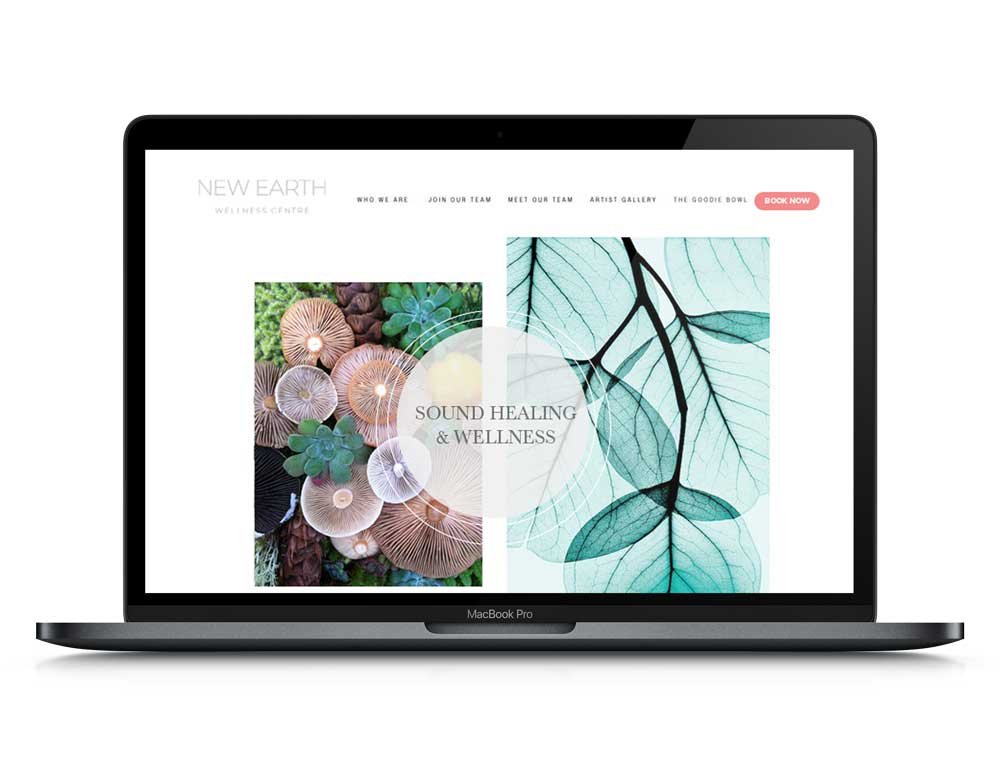

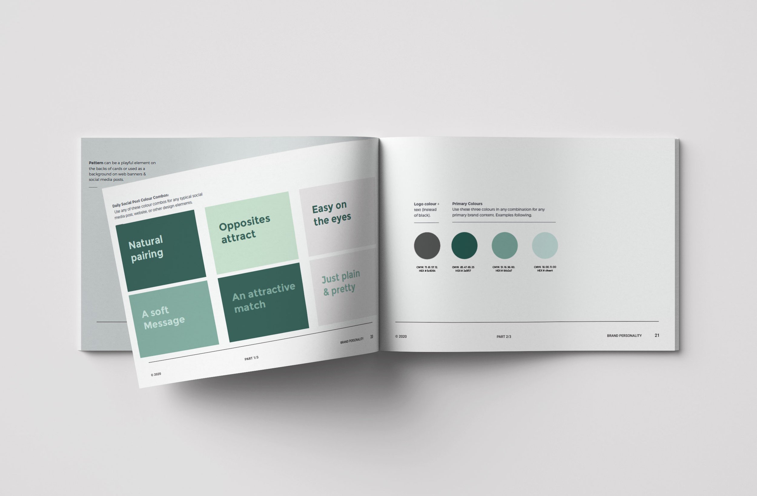
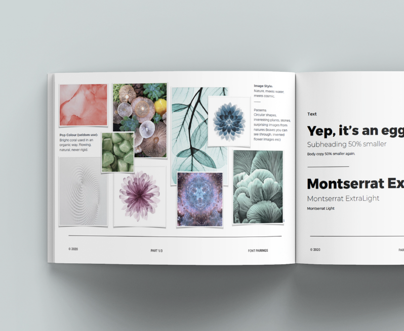
-
To bridge the gap from ‘woo woo’ to ‘real’. Create a brand and experience that feels relatable and welcoming to everyone.
-
A calm escape.
Give the customer a guilt-free eggscape from chaos. People love sharing unique experiences and how it made them feel. They don’t have to believe in the benefits of sound and light therapy to fully enjoy the relaxation of the session.
-
A profitable business since the doors opened
More social followers than the creators of the egg themselves
Viral videos
Full-time employees
A strong decision-making filter for their brand
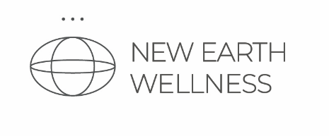
The logo.
It’s a sideways egg. The sphere represents The Harmonic Egg, a metaphysical eye, and the earth (a ‘new’ earth, not a sphere). The 3 dots represent motion (energy movement), sound waves (sound healing), and communication (re-connecting to ourselves)


Project Details.
Logo Design
Style Guide
Interior Design Guide
Marketing + Social Media Support
The Team.

CORTNEY WALKER
Designer

AARON GONZALEZ
Brand Strategist
Project Reviews.
-

"The clarity Cortney provided helped us get approved for a large business grant
Pam Baker, Co-CEO
-
"Now we have a brand filter we use for everything from daily decisions to big marketing investments.
Kristy Thompson, Co-CEO